The right way to calculate process limits
The utility of process behavior charts rests in their ability to discriminate between the two types of variation: common causes of routine variation and assignable causes of exceptional variation. This utility is a function of Shewhart's generic three-sigma limits:

Here, Average represents the mean of the dataset and 3 · Sigma is a generic placeholder for one of several within-subgroup measures of dispersion. While you may be inclined to take these generic three-sigma limits literally—and thus add and subtract three times the global standard deviation from a dataset’s average—the calculation of process limits using the global standard deviation will yield inflated limits. This can produce situations where assignable causes of exceptional variation go undetected. To avoid this, the Upper Process Limit (UPL), Lower Process Limit (LPL), and Upper Range Limit (URL) for a dataset composed of logically comparable individual values should be calculated using following formulas:

Here, the X-bar is the mean of the individual values in the dataset, 2.660 and 3.268 are scaling factors, and mR-bar is the average moving range.
The 2.660 scaling factor is required in the formulas for the UPL and LPL to convert the average moving range into the appropriate amount of spread for the individual values. When a dataset consists of logically comparable individual values, the value of this scaling factor will always be 2.660. The 3.268 scaling factor is used to convert the average moving range into the appropriate upper bound for the moving ranges. For subgroups of size n = 2, as is the case when calculating the difference between successive values in a dataset, the value of this second scaling factor will always be 3.268.
Before the average moving range can be calculated, the moving ranges must be calculated. The moving ranges are the absolute value of the difference between successive values in a dataset. For instance, if the first value in a dataset of individual values is 3 and the second value is 2, the absolute value of the difference is 1. If the second value in a dataset is 2 and the third value is 4, the second moving range is 2. Continuing this process for successive pairs of values in a dataset produces the moving range.
“The proper use of data requires that you have simple and effective methods of analysis which will properly separate potential signals from probable noise.”
— Donald J. Wheeler
Why global standard deviation doesn’t work
If Shewhart’s generic formula for calculating process limits capable of discriminating between the two types of variation is Average +/- 3 Sigma, why can we not use the global standard deviation statistic to these limits? Is it not the case that, in statistics, Sigma represents the standard deviation of a dataset?
Standard deviation is a measure of dispersion that relates the distribution of all the values in a dataset to the mean. Its calculation assumes that
the data can be logically considered to be one large homogeneous collection of values, all obtained from the same underlying and unchanging process (Donald J. Wheeler, Making Sense of Data).
This assumption sits at odds with the intent of the XmR chart which
examines a collection of values to see if they might have come from one underlying or unchanging process, or if they show evidence of process changes (Donald Wheeler, Making Sense of Data).
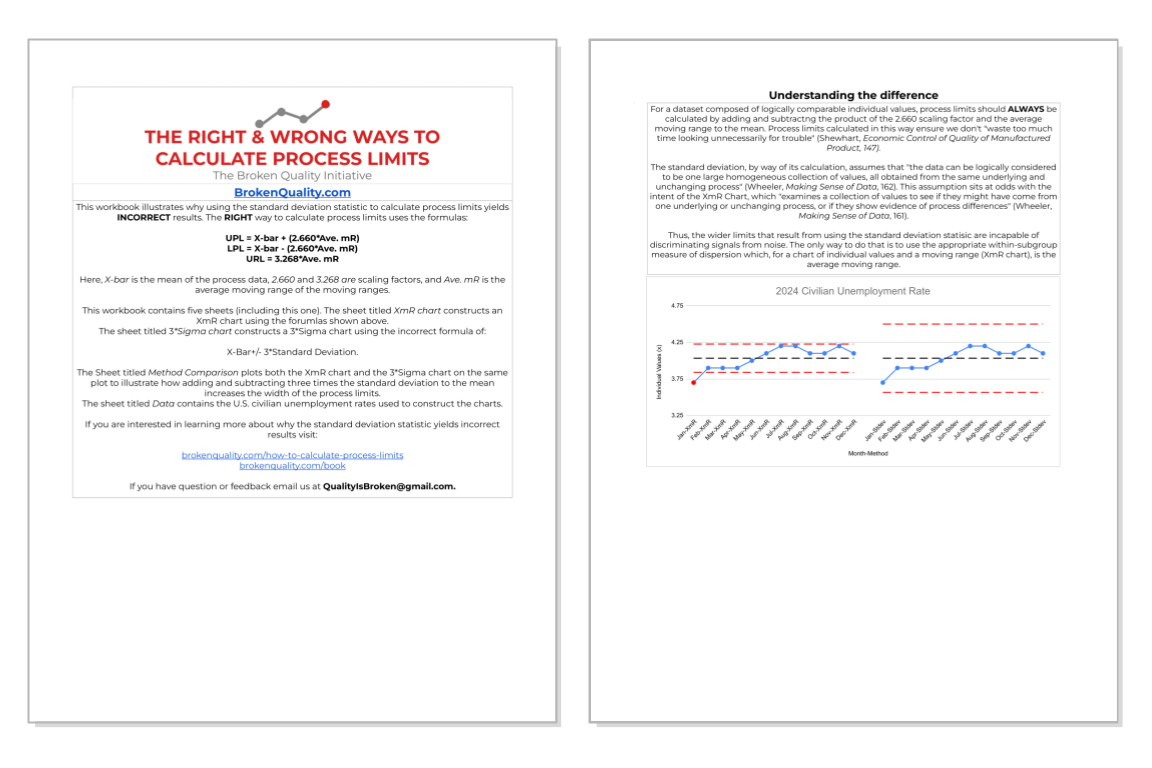
Said another way, the XmR chart examines process data for evidence of non-homogeneity while the standard deviation statistic assumes a dataset is homogeneous. This mismatch in purpose makes the standard deviation ill suited for the calculation of process limits, especially for a dataset that exhibits nonhomogeneous behavior like that shown in Figure 1. In Figure 1 the limits for the chart on the left are calculated by adding and subtracting three times the global standard deviation to the mean (Average +/- 3s). The limits for the X chart on the right are calculated by adding and subtracting the 2.660 scaling factor multiplied by the average moving range (Average +/- 2.660*Ave. mR). The differences, to say the least, are noticeable.
Fig 1: Comparison of limits calculated using different methods for non-homogeneous data.
Granted, the example in Figure 1 is a little contrived. The sawtooth pattern of the data in Figure 1 makes it clear that the data is not logically comparable. All of the values above the mean are from one system, while all the values below the mean are from another system. However, if we apply the same logic to a dataset composed of logically comparable individual values, the same results reveal themselves. Figure 2 provides an example.
In Figure 2 the data is composed of logically comparable individual values all from the same underlying causal system. We built an XmR chart for this data in the previous section (Revisit this section by clicking here). In Figure 2, the chart on the left shows limits that are calculated using the formula Average +/- 3 Sigma, while the limits for the chart on the right are calculated using the formula Average +/- 2.660*mR-bar. The wider limits that result from adding and subtracting three times the standard deviation to the mean yield a chart that is less sensitive than its counterpart.
Fig 2: Comparison of limits calculated using different methods for manufacturing data.
While the Lower Process Limit (LPL) for both charts in Figure 2 is zero, the Upper Process Limit (UPL) for the chart using the global standard deviation is 0.18 units greater than the chart that uses the scaling factor and average moving range. While in this particular case, the inflated value of the Upper Process Limit (UPL) does not change the characterization of the underlying causal system (Learn more about characterization here), in instances where values hover near the process limits this discrepancy can be the difference between detecting an assignable cause of exceptional variation and missing it.
In order to get robust process limits, as articulated by Donald J. Wheeler, you must
use the moving ranges to characterize the short-term, point-to-point variation. The formulas then use this short-term variation to place limits on the long-term variation (Making Sense of Data, p. 162).
The interplay between short and long term variation is what makes calculating process limits using the scaling factors and average moving range an effective approach for identifying assignable causes. Without this interplay, the fidelity of Shewhart’s method is lost and the possibility of mistakenly characterizing an unpredictable process as predictable increases.
The RIGHT & WRONG Way Worksheet
It is one thing to be told that calculating process limits using the standard deviation is wrong; it is another to see and understand why it is wrong. This is the purpose of the Right & Wrong Way worksheet. By calculating process limits for a simple dataset using the right approach (Average ± 2.660 × Ave. mR) and the wrong approach (Average ± 3 × Stdev), the limitations of using the standard deviation become clear.