XmR Chart Workbook & Quick Guide
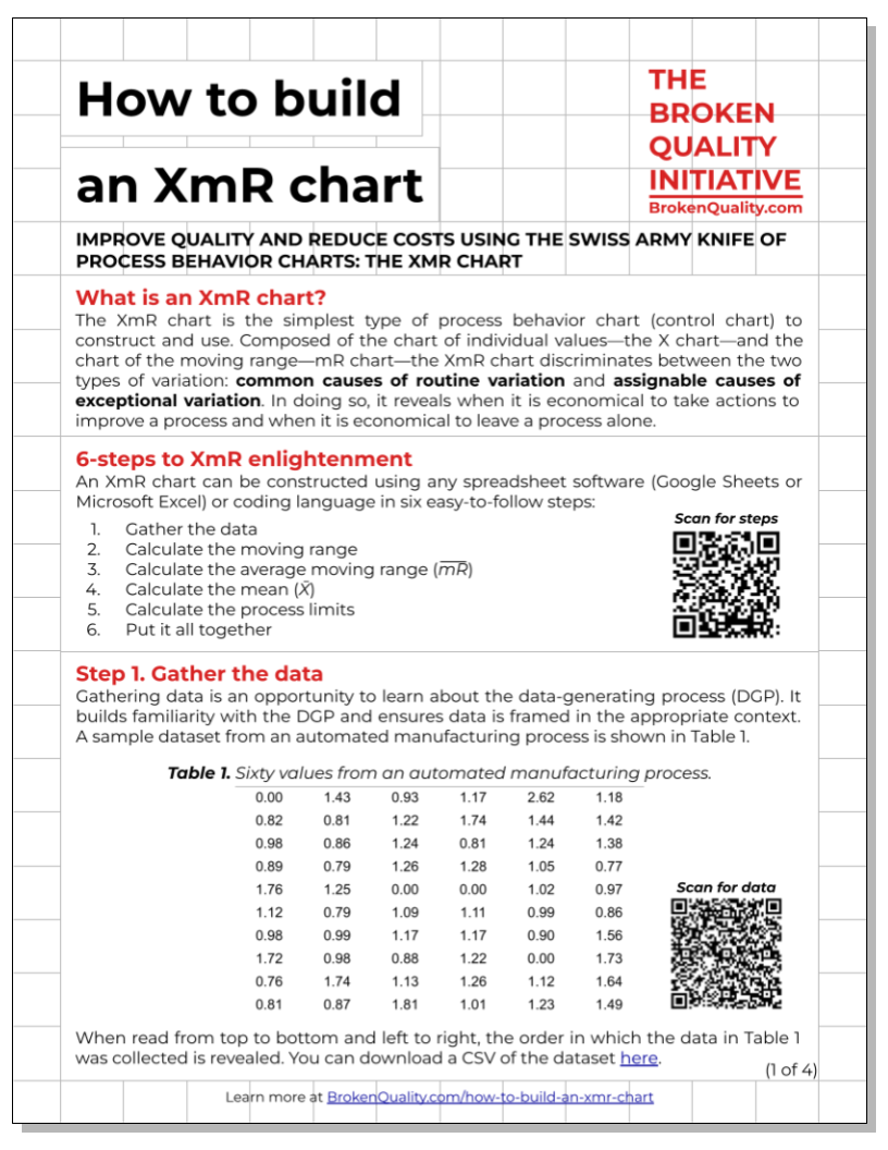
The XmR Chart Workbook & Quick Guide teaches you how to build the most useful type of process behavior chart—the XmR chart. By following a six-step process (listed below), you’ll learn how to organize a spreadsheet and calculate process statistics in a way that makes constructing an XmR chart straightforward and intuitive.
Gather the data
Calculate the moving ranges
Calculate the average moving range
Calculate the mean
Calculate the process limits
Put it all together (construct the chart)
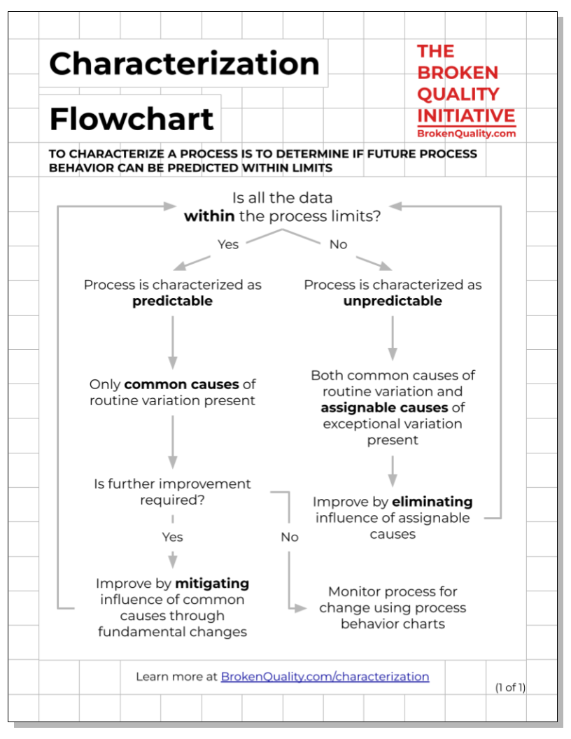
Characterization Flowchart
The Characterization Flowchart outlines the logic of process characterization. What is characterization? To characterize a process is to determine if future process behavior can be predicted within limits. If it can, a process is characterized as predictable. If it cannot, a process is characterized as unpredictable. Whether a process is characterized as predictable or unpredictable depends on the data’s relationship with the process limits. The Characterization Flowchart outlines the logic of characterization.
The RIGHT & WRONG Way Worksheet
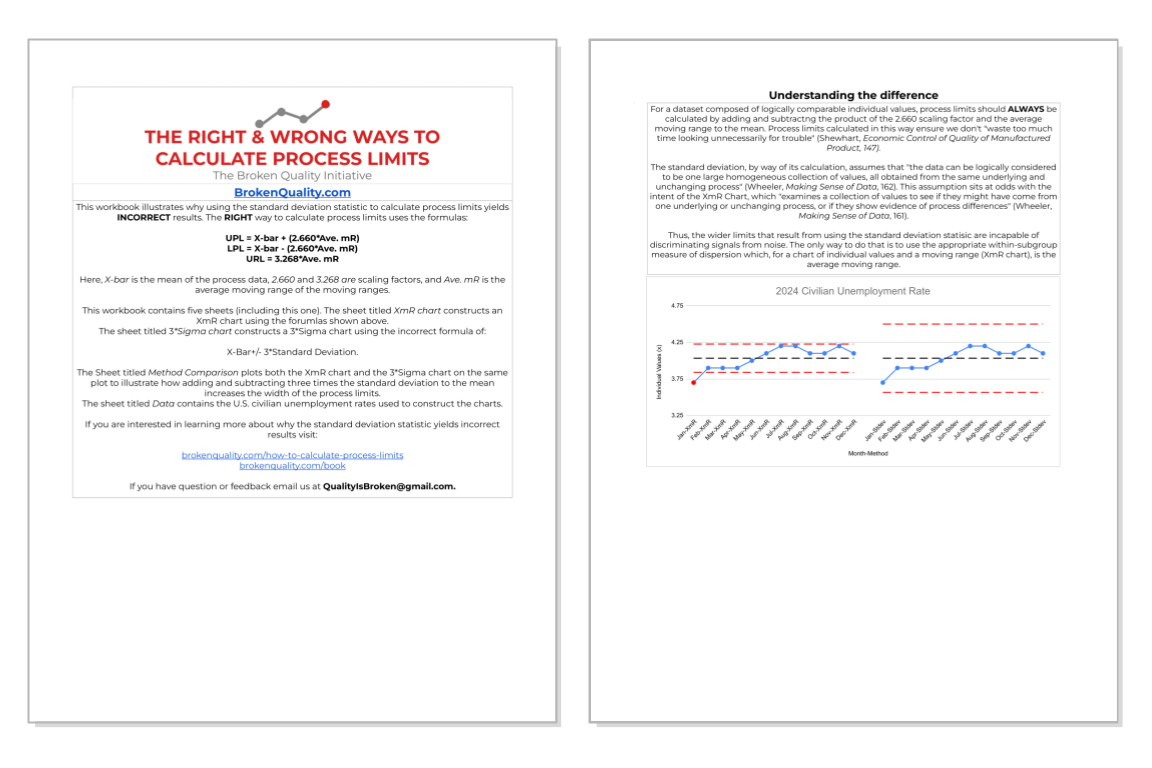
It is one thing to be told that calculating process limits using the standard deviation is wrong; it is another to see and understand why it is wrong. This is the purpose of The Right & Wrong Way Worksheet. By calculating process limits for a simple dataset using the right approach (Average ± 2.660 × Ave. mR) and the wrong approach (Average ± 3 × Stdev), the limitations of using the standard deviation become clear.
Software Verification Quick Guide
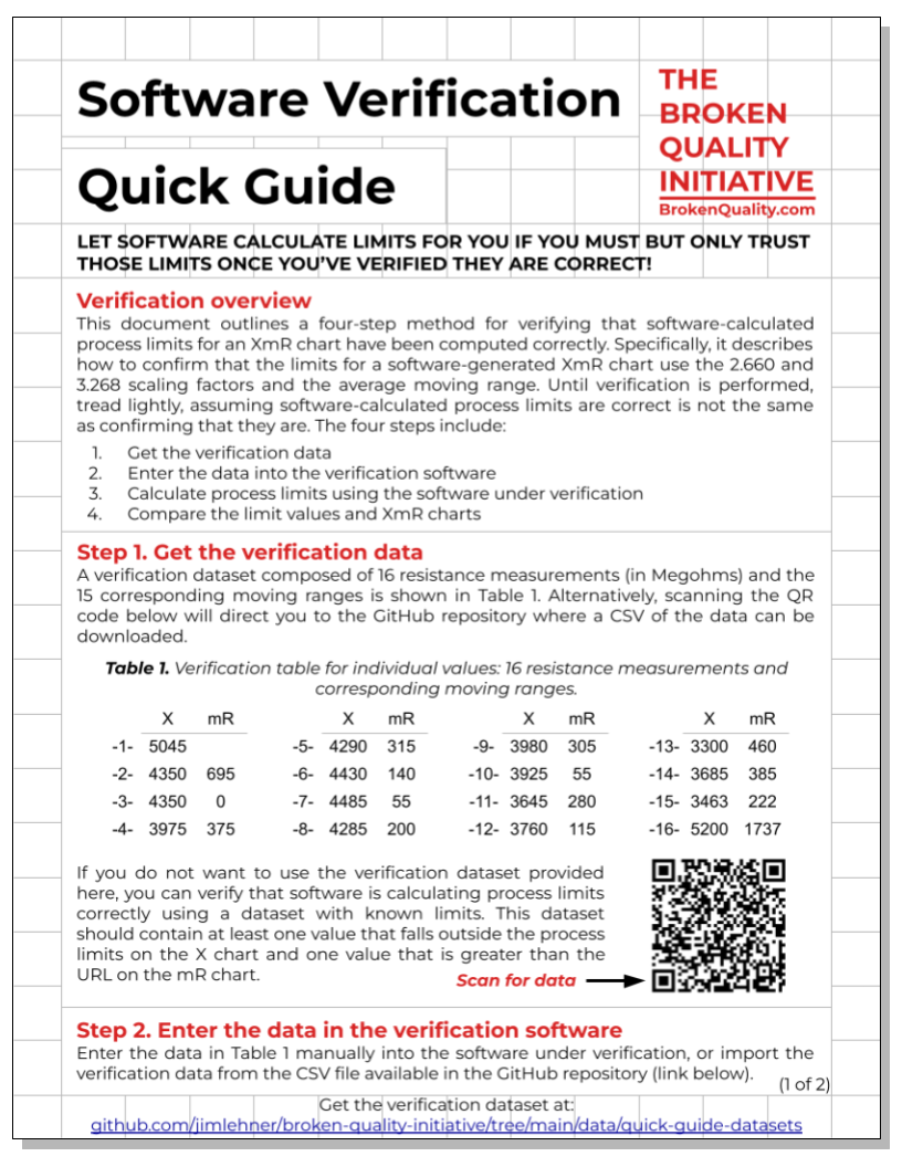
Software companies are not in the business of teaching you how to make sense of data by understanding variation. They are in the business of selling you software. Have software build process behavior charts for you if you like, but only do so after verifying that the software-calculated process limits are correct using the instructions in the Software Verification Quick Guide.